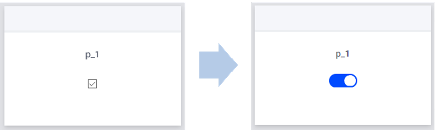
Display an On/Off Switch in Widgets
Identifiers with binary range are displayed as checkboxes in table and scalar widgets of AIMMS WebUI, by default. You can render on/off switches instead of checkboxes using CSS.
Using CSS to Render a Switch
Like all application specific resources (ASR), you will need to place the corresponding CSS files in the MainProject\WebUI\resources folder. Note that the resources folder does not exist by default. You can create a folder named css for better organization of your files, making the final directory MainProject\WebUI\resources\css.
Download this CSS file and place it in the above folder to render all checkboxes as switches (in both scalar and table widgets) in your project.
If you want to limit this change only to scalar widgets, you can introduce the modifier .tag-scalar for all the snippets as done in the below file.
To restrict this change to only table widgets instead of scalar widgets, simply replace all occurrences of .tag-scalar with .tag-table
Note
For scalar widgets in AIMMS versions below 4.70.1, use this files instead as the CSS classes have been modified for this widget.
Customizing the Switch
You can modify the CSS used to make the switch in many ways. For example, to create the switch for pivot table widgets, to change the color of the switch, or apply the switch rules only to some widgets.
To customize the behavior of the CSS for the switch, follow the guidelines below.
Alignment of Switch
The horizontal alignment of the switch is center by default. However, this is depends on the width of the scalar widget / width of the columns in the table widget and you might need to adjust the code accordingly. Change the value of the left attribute (line #23 in the file binary-switch.css) to get the desired alignment.
1.cell-wrapper input[type=checkbox][class*=boolean] + span {
2        float:right;
3        left: -35%;
Color of Switch
The color of the switch can be modified by editing the background color defined in the CSS snippet below. The default AIMMS blue color hexadecimal code is #004bff. You can replace this color code in the CSS snippet.
1.cell-wrapper input[type=checkbox][class*=boolean]:checked + span {
2        background: #004bff !important;
3}
Compact Scalar Widget
You will need an additional CSS snippet to properly render the switch in compact scalar widgets. Add the below code at the end of your CSS file.
1.tag-scalar.compact-scalar input[type=checkbox][class*=boolean] + span {
2    top: 8px;
3}
See also