Change Hover and Select Effects for WebUI Charts
This article explains how to use CSS to customize the states of a chart or map widget on hover and on select.
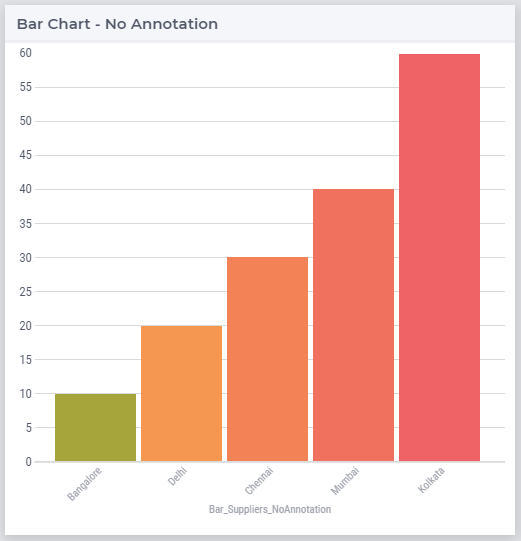
Default Chart Behavior
These effects are the same for all the charts types.
Each chart has 3 states:
Default state – all bars have the same opacity
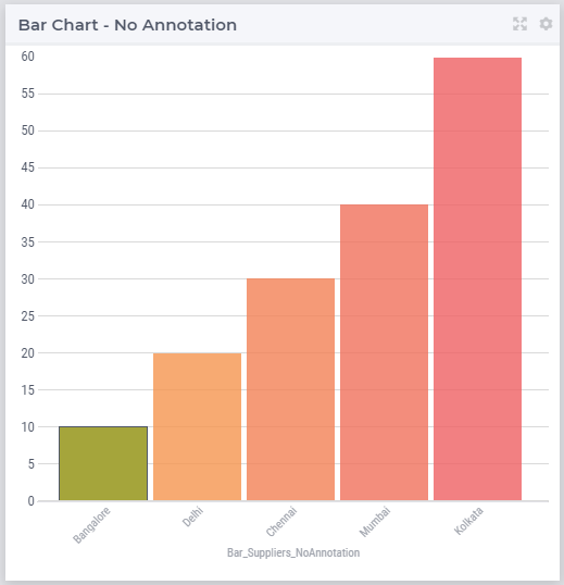
Hover state – hovered bar remains solid, opacity slightly reduced for the other bars
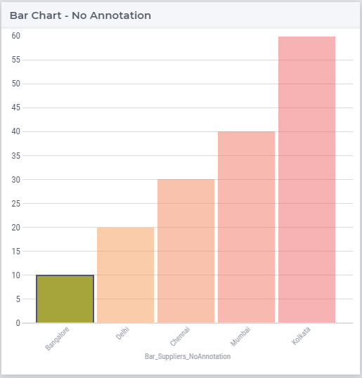
Selected state – selected bar remains solid, opacity is further reduced for the other bars
Note
Nodes in the Map widget have a slightly different behavior
Default - all nodes have same opacity and no border
Hover - hovered node has a 1px border
Selected - selected node has a 2px border, opacity reduced for the other nodes
To customize the styles for these states, you’ll need to add a CSS file in the folder MainProject\WebUI\resources\css.
You can use the chart in WebUI Annotations - Widget and CSS support for a reference of elements and their corresponding CSS properties.
Example CSS
You can download the file below which contains the code snippets to change styles for the 3 states in charts.
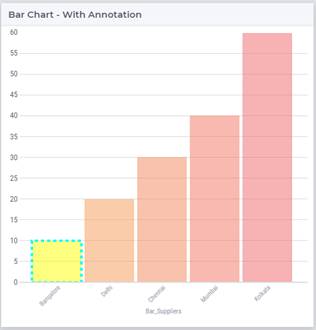
In the images below, the first bar on the left has custom styles applied.
Hover
 1/* Hover State */
 2.annotation-bar_blue.chart-item:hover,
 3.annotation-bar_blue.chart-item.is-hover {
 4   /* fill changes  */
 5   fill: orange;
 6   fill-opacity: .5 !important;
 7   /* stroke changes  */
 8   stroke: aqua !important;
 9   stroke-width: 4 !important;
10   stroke-dasharray: 5;
11}
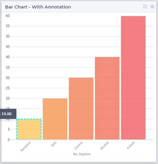
Selected
 1/* Selected state */
 2.annotation-bar_blue.chart-item:active,
 3.annotation-bar_blue.chart-item.is-active {
 4   /* fill changes  */
 5   fill: yellow;
 6   fill-opacity: .5 !important;
 7   /* stroke changes  */
 8   stroke: aqua !important;
 9   stroke-width: 4 !important;
10   stroke-dasharray: 5;
11}